Statistics & Data Literacy
4.1 Base Rate Neglect and Bayes' Theorem
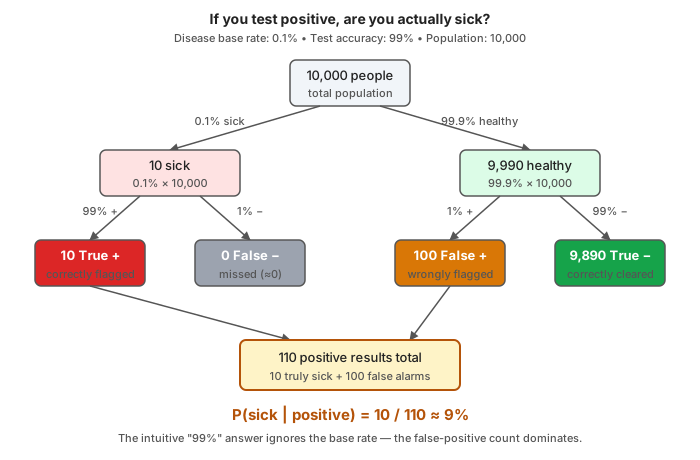
Suppose a rare disease affects 1 in 1,000 people (a base rate of 0.1%). A test is marketed as "99% accurate"—meaning a 99% true positive rate for sick people and a 99% true negative rate for healthy people.
If you test positive, what is the probability you actually have the disease? Most intuitively guess 99%. The real answer is ~9%.
Here is why, in a population of 10,000:
- 10 sick people: The test correctly flags ~10 of them (true positives).
- 9,990 healthy people: The test incorrectly flags 1% of them, yielding ~100 false positives.
You are in a pool of 110 positive results, but only 10 are actually sick. Your real chance of having the disease is .
This is the math behind Bayes' Theorem:
The human tendency to fixate on specific information (the 99% accuracy) while ignoring background statistics (the 0.1% base rate) is base rate neglect. It creates the False Positive Paradox: when searching for something extremely rare, the "noise" (false positives from the massive healthy population) drowns out the "signal" (true positives), even with a highly accurate test.
Targeted vs. mass screening: This is why doctors avoid full-body MRI scans for healthy adults—the base rate is so low that almost all positives are false alarms. But if a patient has severe symptoms, their personal base rate jumps (e.g., to 10%). With a 10% base rate, the same 99% accurate test suddenly yields a 91.6% chance of actual illness.
Political implications: Imagine an airport facial recognition system looking for terrorists. Even if 99.9% accurate, the microscopic base rate guarantees the system will flag thousands of innocent people for every actual threat.
4.2 Correlation vs. Causation
Two variables are correlated when they move together (e.g., ice cream sales and drowning deaths both rise in summer due to an obvious confounder: temperature).
But confounders aren't always obvious. If a study claims breakfast improves health, there are obvious alternatives: confounding (breakfast eaters might exercise more), reverse causality (healthier people might have morning appetites), or selection bias.
The gold standard for causation is the randomized controlled trial (RCT), which balances confounders via random assignment. When RCTs are impossible, researchers rely on quasi-experimental methods with strict underlying assumptions.
The political reflex to watch for: "X is correlated with Y; therefore, X causes Y, justifying policy Z." Each arrow requires separate evidence. Collapsing them is a common sleight of hand in policy debates.
4.3 Simpson's Paradox
In 1973, UC Berkeley's aggregate graduate admissions showed a gender gap: 44% of men were admitted versus 35% of women. But broken out department by department, women were admitted at equal or higher rates. The aggregate gap existed because women disproportionately applied to highly competitive departments with lower overall admission rates.
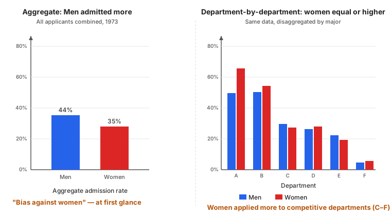
This is Simpson's Paradox: a trend in aggregated data reverses or disappears when disaggregated into subgroups. It arises whenever a confounding variable is unevenly distributed across groups.
Formally:
yet:
The lesson: Whenever presented with an aggregate comparison, ask what happens when you condition on relevant subgroups.
4.4 Survivorship, Selection, and Publication Bias
These are variations of the same problem: analyzing a non-random sample as if it were random.
Survivorship bias draws conclusions from winners while ignoring losers. In WWII, the military wanted to reinforce returning bombers where they had bullet holes. Statistician Abraham Wald noted the error: planes that returned survived those hits. The lethal zones were where returning planes had no holes, as planes hit there never came back. Similarly, studying only successful entrepreneurs ignores the many who did the same things but failed.
Selection bias occurs when a sample systematically differs from the target population (e.g., hospital quality studies skewing negative for top institutions because they handle the hardest cases).
Publication bias is selection bias in scientific literature. Journals preferentially publish positive, statistically significant results, so the published record is a skewed sample of all the studies actually run. Meta-analyses that pool these studies only amplify the distortion.
4.5 How to Lie with Charts
A chart is a visual argument that can be easily manipulated:
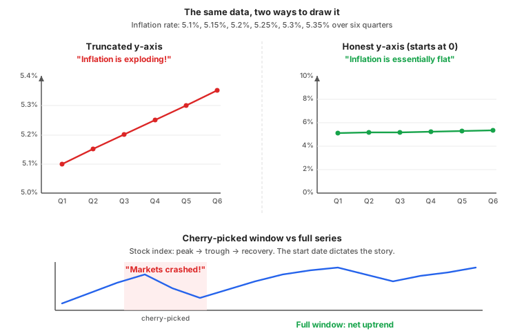
- Truncated y-axis: A comparison of 5.1% and 5.3% looks like a dramatic spike if the axis starts at 5.0% rather than 0.
- Cherry-picked timeframes: The stock market "crashed" from the peak but "recovered" from the trough. The start date dictates the story.
- Dual-axis manipulation: Plotting variables on different y-axes with independent scales can create an illusion of correlation where none exists.
- Misleading scales: Logarithmic scales compress large values (deceptive if unstated), while linear scales can misrepresent constant exponential growth rates as sudden explosions.
- Area and volume distortion: Icons scaled by height distort perception, as area scales by the square of the height and volume by the cube. A figure twice as tall looks four times as large.
The defense is simple: read the axes before you read the chart.
4.6 Goodhart's Law
When a measure becomes a target, it ceases to be a good measure.
A metric is useful because it correlates with an underlying objective. But once people are rewarded on the metric, they optimize for the metric itself, and the correlation breaks. For example, a nail factory rewarded for the number of nails produces tiny, useless ones; rewarded for total weight, it produces a single enormous nail.
Goodhart's Law is universal:
- Education: Teaching to standardized tests improves scores but degrades actual learning.
- Policing: Quotas for arrests lead to low-quality arrests; crime targets lead to "juking the stats" by reclassifying crimes.
- Healthcare: Surgeons evaluated on mortality rates may refuse high-risk patients.
Why this matters: Government targets like GDP growth or crime statistics are vulnerable to Goodhart's Law. The essential question is what incentives the measurement creates, and whether they have corrupted the metric.
4.7 p-Hacking, the Garden of Forking Paths, and Effect Sizes
The conventional threshold for "statistical significance" () indicates less than a 5% chance of observing the result if the null hypothesis were true.
p-hacking exploits analytical flexibility to push p-values below this threshold. Running 20 independent tests guarantees a 64% chance of at least one false positive from pure noise:
The garden of forking paths is subtler: researchers unconsciously make analytical choices (variable inclusion, outlier handling) that lean toward publishable results, inflating false positives.
Effect size vs. statistical significance: A massive study can detect a statistically significant effect with zero practical importance (e.g., a clinically meaningless 0.1 mmHg drop in blood pressure with ). Significance identifies non-noise results; effect size determines practical importance.
4.8 Modern Cases
China's GDP: Li Keqiang reportedly called China's GDP figures "man-made" and tracked electricity use, rail cargo, and bank lending instead. This is Goodhart's Law in action: officials promoted on GDP have every reason to inflate it, and the number drifts from reality.
The Wealth-Voting Paradox: In the US, the wealthiest states (like Massachusetts) generally vote for Democrats, while the poorest states (like Mississippi) vote for Republicans. Looking at this aggregate data, you might assume wealth causes people to vote Democrat. But when you disaggregate to the individual level—particularly in elections from the 1980s through 2012—the trend reversed: within almost every state, wealthier individuals were more likely to vote Republican. (Note: recent educational polarization in the 2020s has started to blur this specific trend, but it remains a classic textbook example). Assuming individual behavior from aggregate group data is a statistical trap known as the ecological fallacy (a variation of Simpson's Paradox).
India's Aadhaar: India's biometric ID system has error rates around 1–5%. That sounds small, but base rate arithmetic scales it to millions of denied services for the poorest citizens. Aggregate statistics mask a disaggregated reality where the system fails those who need it most.
4.9 How to Analyze a Statistical Claim
Every statistical claim encodes measurement, sampling, and analytical decisions—each a potential point of manipulation. Use this vocabulary to interrogate them:
- Probability: Ask about the base rate.
- Causation: Ask if evidence rules out confounders, reverse causality, and selection effects.
- Aggregation: Check if comparisons survive disaggregation (Simpson's Paradox).
- Success stories: Ask about the unseen failures (survivorship bias).
- Charts: Read the axes first.
- Targets: Ask if the metric has decoupled from the objective (Goodhart's Law).
- Definitive studies: Ask about replication, effect size, and pre-registration.